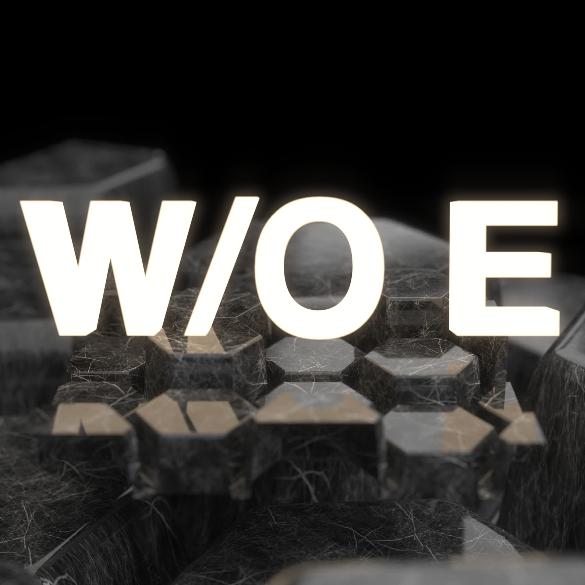
last one. the white is cool too, although i’d turn the “brightness” on the type down just a bit
lovin it mate
Yeh probably not the most practical, but I still think it looks sick. I do like that alternate too, the slight glow is cool
First one
")
fuk thats sick
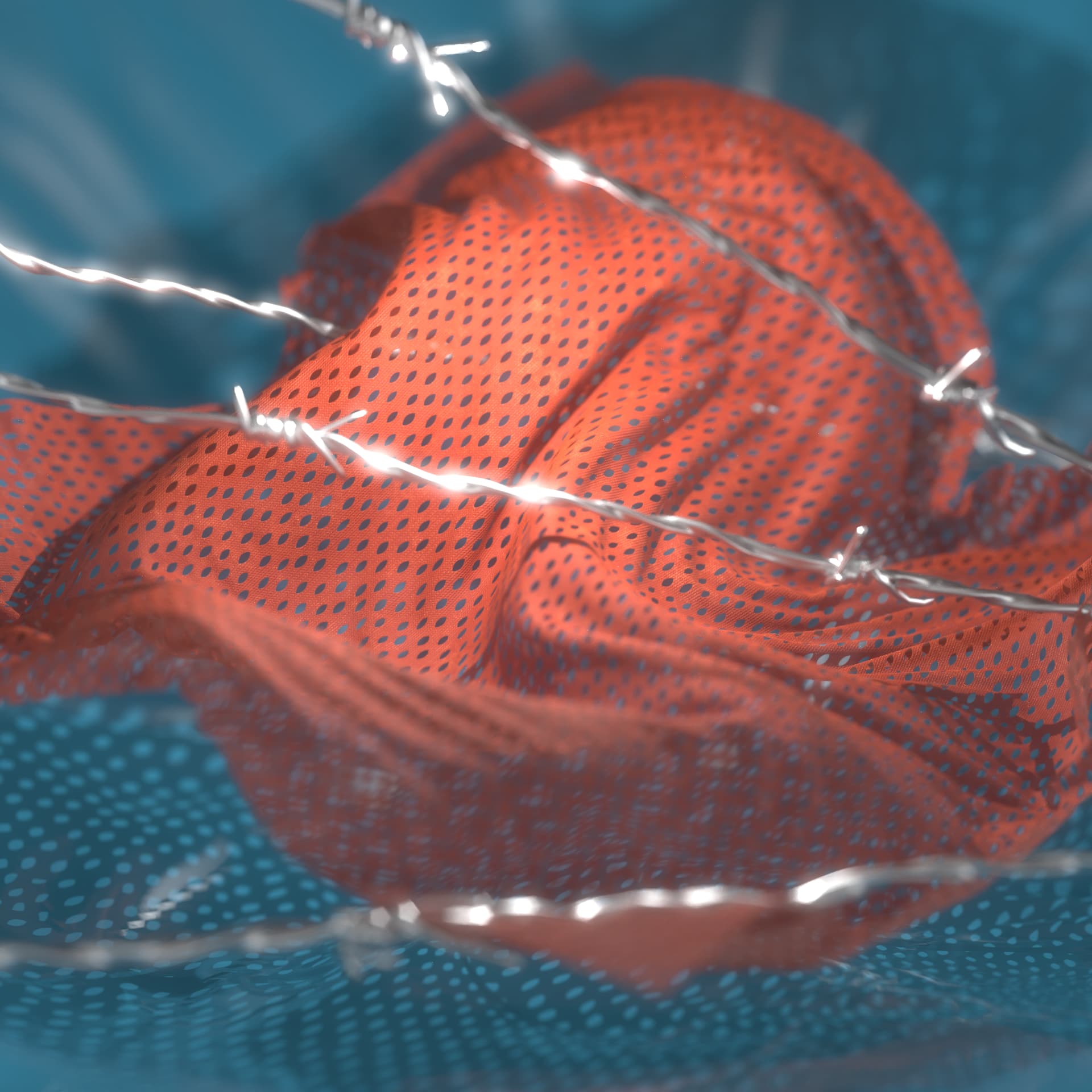
No idea what’s going on here but I got a bad feeling about it.
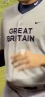
Great Britain is the only team in world baseball classic that has generic font jerseys. I’m feelin it though! “WHERES MY MONEY?”
Norfik is sick. And so is this cover art.
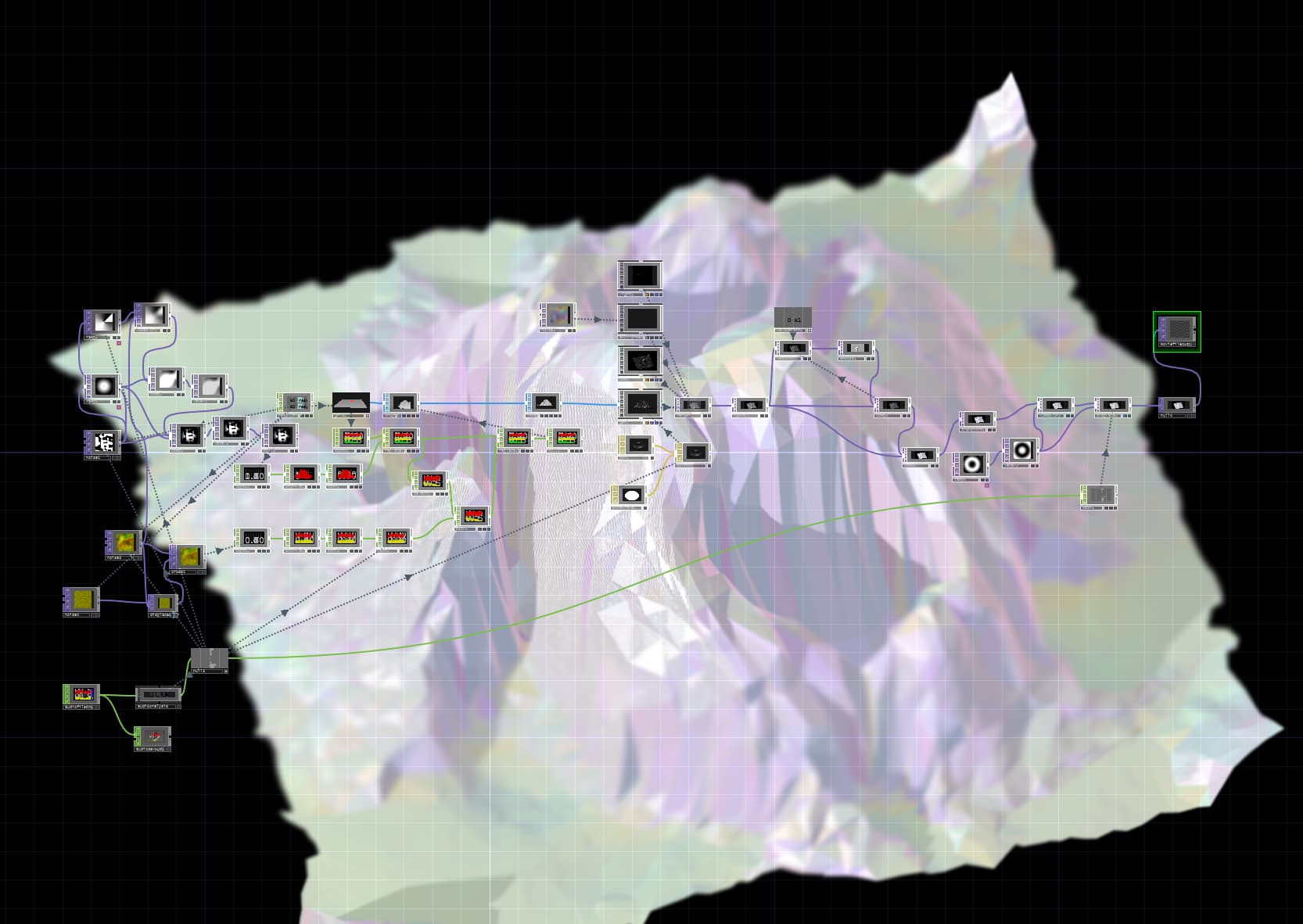
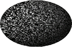
Fucked around a bit with GIMP.
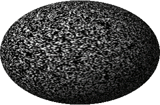
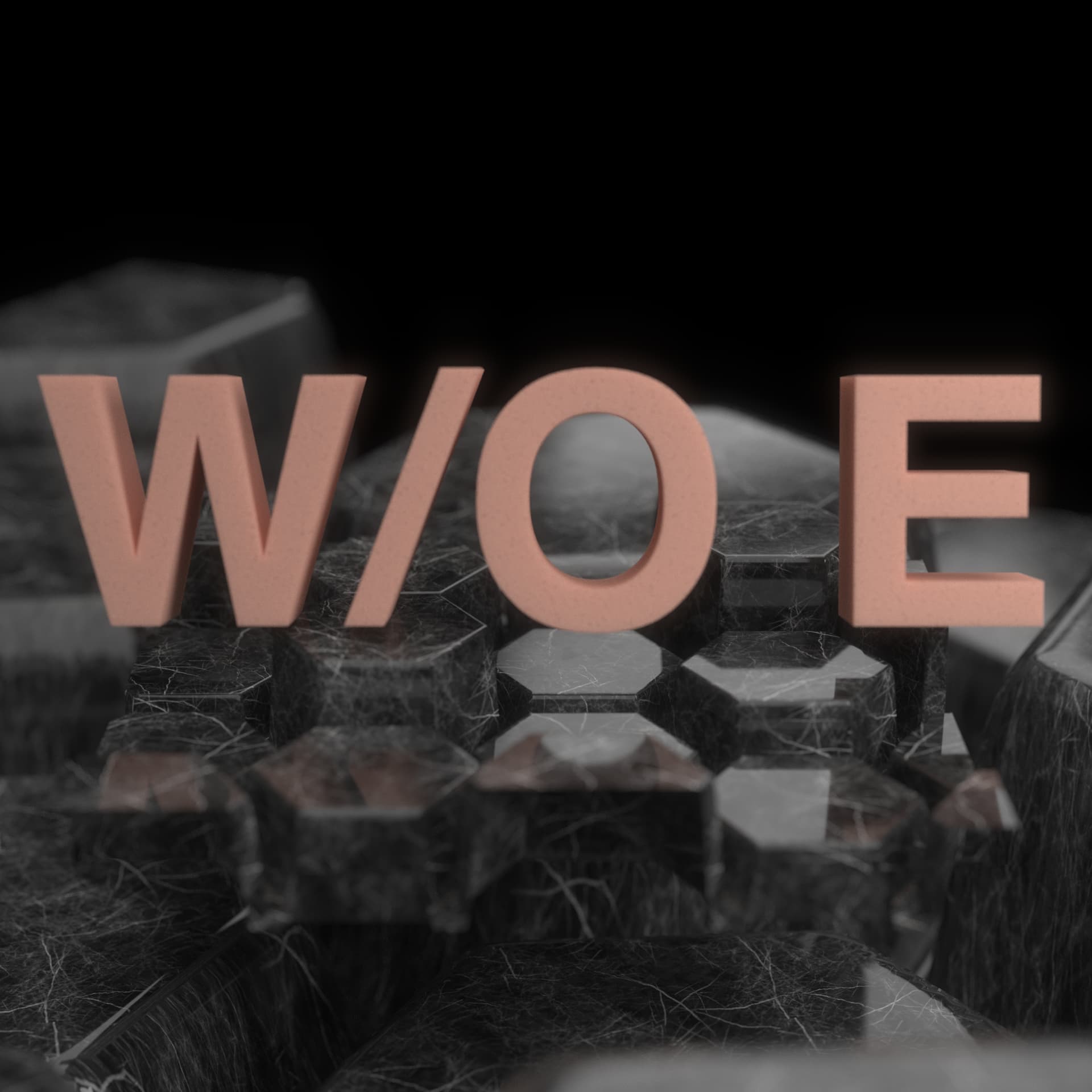
Version 2:
I like version 2 a tad bit more than version 1.
this is really cool man, you should check out Touch Designer, I know cyc’s a fan, can do some really vibey stuff in there
Thanks man. Yeah, been looking at Touch Designer a bit. These things are just several layers of modified images made into gifs, so not very “high tech”, hehe. Just used an algo to make spheres in GIMP. Definitely possible to make cleaner versions, was just messing around.
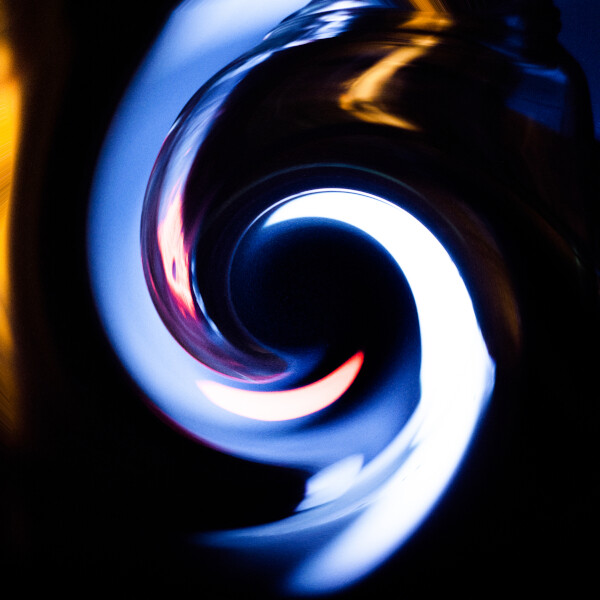
Love ‘not very high tech’, all my vids are super manual processes, multiple layers of fuckery between like 4 free phone apps, glitches are constant and inform everything. Started getting into Blender but the outcome was never surprising, always predictable and my original vision is never fully formed so i need that malfunction input to aid the process.
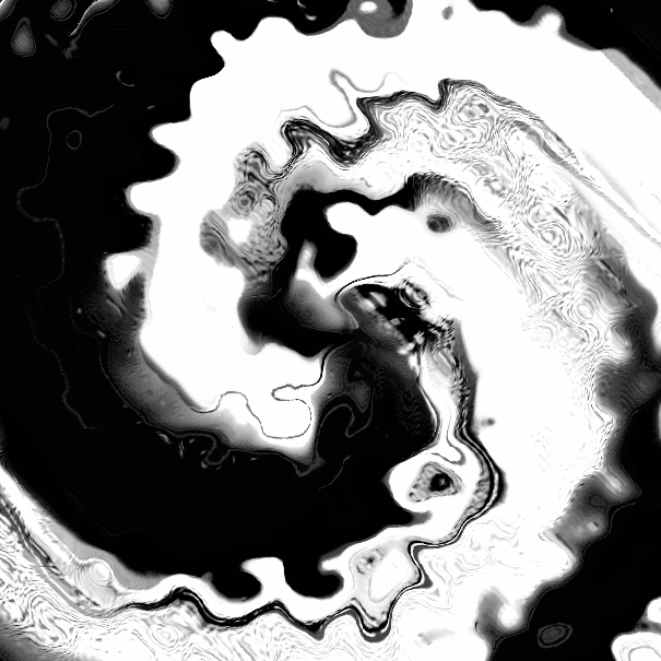
Love gif as a format, so much can mess up in a good way, that 3rd one you posted looks like 70s space-probe footage of a weird planet or smthing